Projects
* indicates Editor's Pick; click images to view projects
Comparing U.S. Presidents’ First Years
February 4, 2022
In part one of this project, I created a model for sentiment analysis with tensorflow. I used this model to perform sentiment analysis on news article abstracts from the past four U.S. presidents’ first years in office.
In part two, I visualize the results of this analysis in Tableau. I also include the ten most commonly used words each month, for each president. Finally, I include presidential approval ratings from Gallup, to see how news sentiment correlates with (or diverges from) public approval.
The end result is this Tableau Dashboard.

NYT Sentiment Analysis with TensorFlow
January 9, 2022
Now that we are one year into the Biden Administration, I started to wonder how positive news coverage was during his first year in office vs. previous presidents’ first years. To find the answer, I decided to perform sentiment analysis on NYT article abstracts for each month of the past four presidents’ first years in office.
In this project I pull data using the NYT API pynytimes, perform sentiment analysis with the library TextBlob, create my own model for sentiment analysis with TensorFlow, compare the two models, and visualize the results.

*Spotify API and Audio Features
September 30, 2021
One gal’s journey to make a playlist her mom can dance to.
The most fun I’ve ever had dancing on a night out was when I went to an Indie Night on a Tuesday in London in 2015. I have frequently exercised while listening to Phoebe Bridgers. This morning I looked at the “Sad Girl Starter Pack” playlist on Spotify and thought “wow these songs are all bops!” Needless to say, I am not the best person to ask to DJ a party.
Fortunately, after downloading my library from Spotify I was able to use Spotify’s API to pull a number of audio features about each song: Danceability, Energy, Instrumentalness, Popularity, Speechiness, and Tempo. I can now see which songs in my library score highest/lowest on these metrics, as well as how my most-played songs & artists fall on the spectrum.

Visualizing Spotify Data with Python and Tableau
September 16, 2021
How to create a dynamic dashboard using your streaming data & Spotify’s API. There are a ton of interesting insights you can glean from analyzing your Spotify streaming and library data — especially when combined with additional data fields obtained via the Spotify API (i.e. genre). I didn’t need to do this project to find out that I’m still addicted to ‘Ribs’ by Lorde, but it was fun to work on nonetheless.

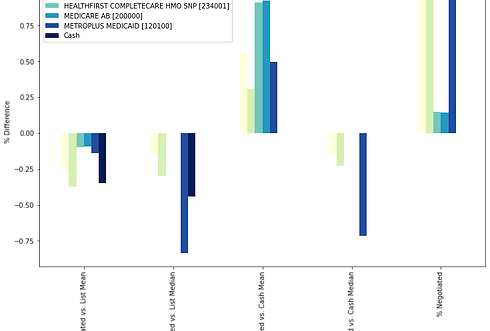
Insights from the NYC Public Hospital System’s Price Lists
April 25, 2021
There is a law that went into effect in January of 2021, which requires hospitals to publish the prices of their procedures in a machine readable format. This (theoretically) includes all procedures’ list prices, discounted cash prices (i.e. the price paid by the uninsured), and prices negotiated by insurance companies.
One hospital system that has published pretty helpful data is the NYC public hospital system: NYC Health + Hospitals. Armed with this data, I have done a very simple analysis of how prices differ:
-
By List Price vs. Cash Price vs. Negotiated Price per procedure (within the same hospital)
-
By List Price and Cash Price for the same procedure across the different hospitals within the NYC public hospital system
*An Interactive Look at Healthcare Price Disparities in NYC
February 15, 2021
“Death comes to all — but in America it has long been considered reasonable to offer the best chance of delay to the highest bidder.” — Zadie Smith, Intimations
I saw with my own eyes how much prices for the same healthcare service could differ across three NYC neighborhoods. In this analysis, I take a look at 2017 Medicare submitted claims obtained from the Centers for Medicare & Medicaid Services, racial demographics, and income. I look at all of this data at a Borough and Neighborhood level. The aim is to find out not only how prices differ, but possibly why they differ.

Putting the Pandemic into Perspective
December 4, 2020
As COVID-19 deaths reach a new daily high in the United States, it feels like an appropriate time to use basic Python concepts to explore the stats around the pandemic. We are at the start of what may be a very difficult winter, but not all of us are in agreement about whether COVID-19 even poses a credible threat. The goal of this article is to put COVID-19 stats into perspective and directly address some common misinformation.

Medicare charges by state in 2017 and 2012
November 19, 2020
Healthcare prices in the United States are notoriously confusing and increasingly…too damn high (in homage to Jimmy McMillan).
In this analysis, I use publicly available datasets from the Centers for Medicare & Medicaid Services (CMS) to answer a number of questions, including:
-
How do healthcare prices differ by state? Can it be explained by differences in median income?
-
How have prices changed over time?
-
If more doctors offer a medical service, does it lower the price for that service (i.e. is competition a good thing in this “market”)?
